Responsive Web Designing
Professional responsive web designing solutions designed around business goals, usability, performance and long-term maintainability.
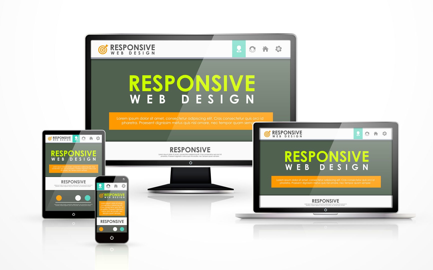
Responsive Web Designing built for real business use
Responsive Web design is the approach that suggests that design and development should respond to the user’s behavior and environment based on screen size, platform and orientation. On an average, close to 50% of websites traffic comes from mobile devices.
What we focus on
- Flexible grids and responsive Bootstrap components
- Breakpoints for phones, tablets, laptops and large screens
- Responsive navigation, tables, forms and media
- Consistent experience across devices and orientations
From requirement to reliable delivery
We structure the work around your business objective, user experience, content, technology and future maintenance needs. The result is a service page or digital product foundation that is easier to use, update and extend.
Why this service matters
Responsive Web Designing should not be treated as an isolated design or development task. It is part of the wider digital experience: how customers discover your business, understand your offer, interact with your website or application, and take the next step.
Our approach combines clear information structure, responsive implementation and practical business functionality so the final result can support marketing, enquiries, customer communication and future improvements.
Understand the requirement
We start with your goals, audience, existing system and desired outcome.
Design and develop
The experience and implementation are shaped around usability, responsiveness and maintainability.
Launch and evolve
The website, application or campaign can continue to be refined as your business grows.
Have a responsive web designing requirement?
Tell us what you want to build, improve or promote and we will help define the next step.